But why do I have to post Instagram Stories?
Instagram is the social network that everyone’s talking about right now. And it owes most of its success to Stories. According to the statistics, 500 million users (that’s half of everyone on Instagram) interact with Stories daily.
Story audiences are still growing fast – so brands have a golden opportunity to connect with their audiences through this agile, entertaining medium. What’s more, because of the way the Instagram algorithm works, posting Stories will help to increase your brand visibility.
So how can you make the most of these 15-second messages? The key is to have a consistent aesthetic, good design, and plenty of original, varied content on offer. For example, DTC beauty brand Glossier has built their reputation on a lively Instagram feed, always in their trademark shade of pink:

If your Story design doesn’t match the style on your profile, you’re losing an opportunity to share your brand with new audiences and build brand recognition. It might sound minor – but if viewers find that your Stories, profile and website all look different, they lose trust in your brand.
Before we get into the nitty-gritty of Instagram Stories, let’s establish which kind of content you’re going to share.
What kind of content can I share in Stories?
- Offers and promotions:
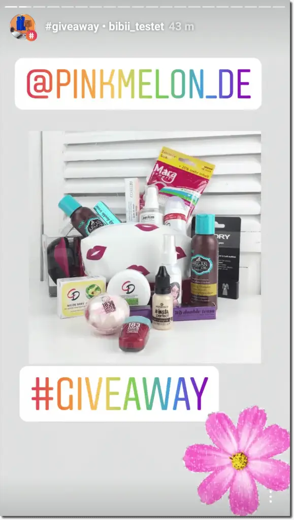
- Surveys and questions:
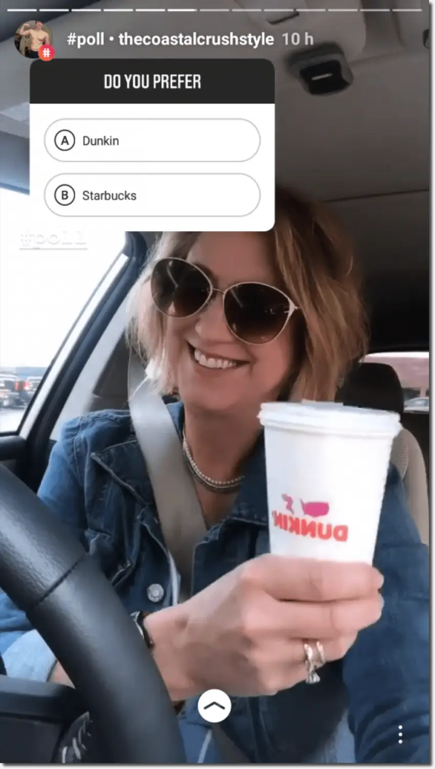
- New post announcements:
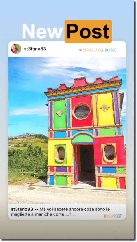
- New video announcements:
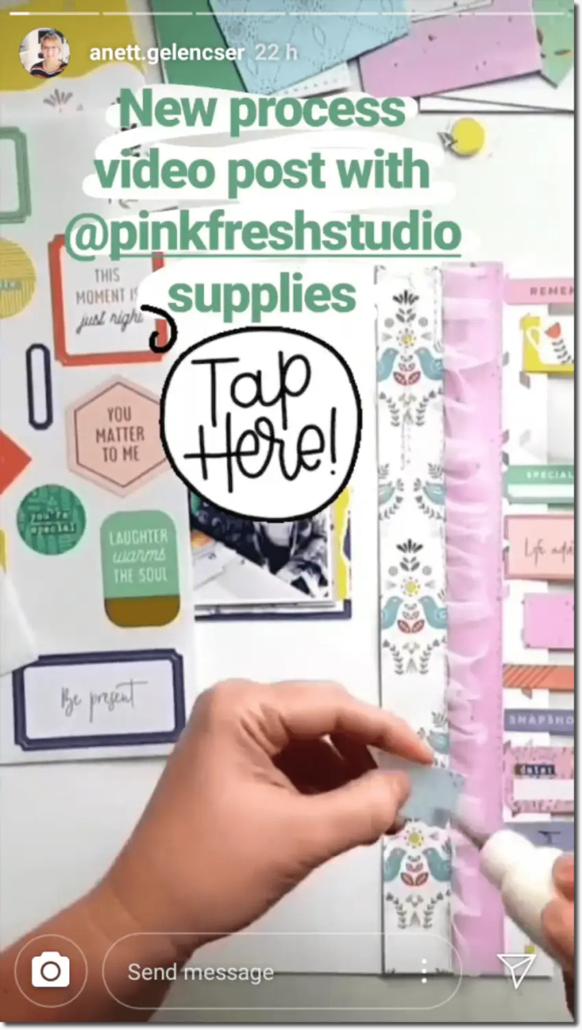
- Promoting your brand hashtag:
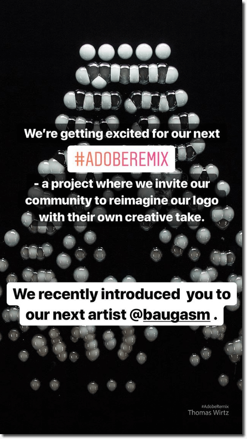
Create a consistent aesthetic that highlights your content types
A consistent style will help followers to recognize your brand’s Stories. And it shows that you care about the little details.
But you can choose how to apply your house style. You could use a single aesthetic for every single one of your posts. Or you could use slight variations to emphasize different types of content.
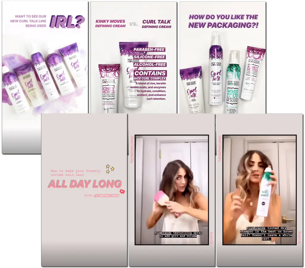
Take a look at these Stories from haircare brand Not Your Mother’s. They use the same color palette for all their Stories – but differentiate tutorials from product Stories with a distinctive black-edged template.
However, even if you differentiate content types, you’ll need to stay within the bounds of your overall aesthetic. Including…
- Always use the same typography and color palette for your Instagram Stories. This makes it easier for followers to recognize your posts.
- Don’t use too much text. Remember, your Stories are only onscreen for 15 seconds! If you write too much, people just won’t have time to read it. Your images should be doing all the heavy lifting when it comes to communication.
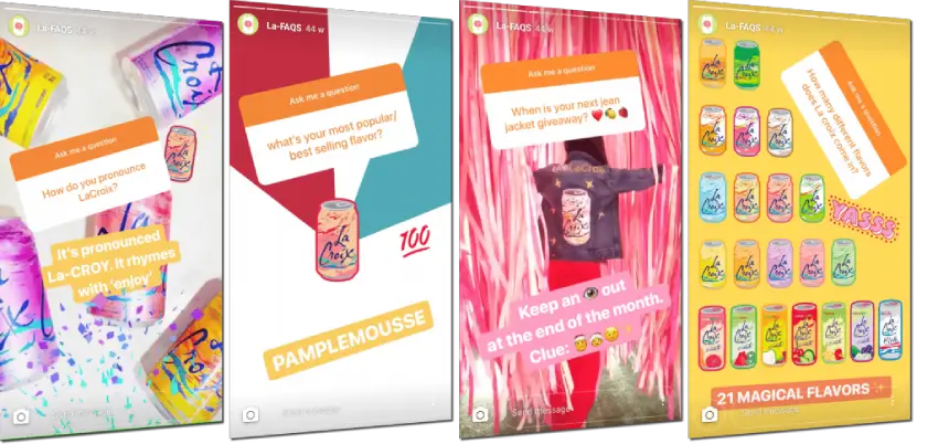
Here’s a quality example from the drinks brand La Croix. They always use the same palette of bright colors as their famous drink cans. And they spread brand awareness even further by making their own Story backgrounds available for followers to download and use.
How do I create Instagram Stories with great design?
Well, thank you for asking. We’ve got a ton of ideas.
Instagram Stories already offer a lot of native options for personalization, such as filters, polls, music stickers, gifs, questions, and so on. Use the resources to the max to make your Stories more exciting.
With that said, though, use gifs and stickers in moderation. Just like with text, if you use them too much, your audience just won’t be able to take in all that information.
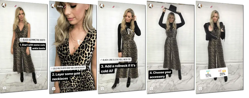
Take a look at this Story sequence from eco-fashion brand Silkfred. Like every great designer, they know that less is more:
Now let’s get into some more detailed tips.
Use hashtags and location stickers
If you add a hashtag to your Story, then it won’t just appear on your followers’ feeds.
Try searching a hashtag in the Instagram Explore feed. You’ll see that they collect the top Stories for that hashtag, ready for new people to discover your brand.
The same goes for location tags. Everyone who looks for that location on Instagram will see your posts and Stories listed.
Run Story polls and surveys
Use the native sticker tools on Instagram to find out what your audience thinks. It’s not just about market research – it’s also an invitation to increase your engagement.
Use templates and backgrounds
There are heaps of apps which offer Instagram Story backgrounds – free and paid. Think of these as shortcuts to a sleek design, if you don’t have the time or budget to produce your own.
Keep a library of templates and backgrounds to hand. Then all you have to do is add an image and a quick call to action. A professional, actionable post in less than five minutes.
Psst! Did you know that we have a library of over 50 Instagram post and Story designs? And they’re all free?
Three apps that we love for quick, easy-access designs
Canva
Canva is an application which lets you design and create content for social media, as easily as possible. Just pick a template to personalize with images, text, fonts, and colors that match your brand aesthetic.
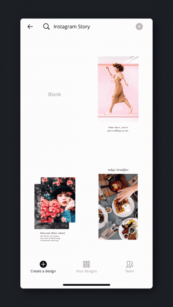
Once you’ve finished, you can share the post directly on social media, or download it to save on your device.
Instasize
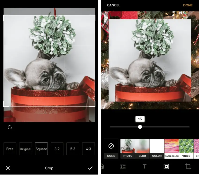
Instasize is one of the most popular apps out there. It’s available on both Android and iOs. Use it to resize horizontal or vertical images for Instagram. (Not every photo has to be square!) You can also edit border colors, build collages, and add filters.
Kapwing
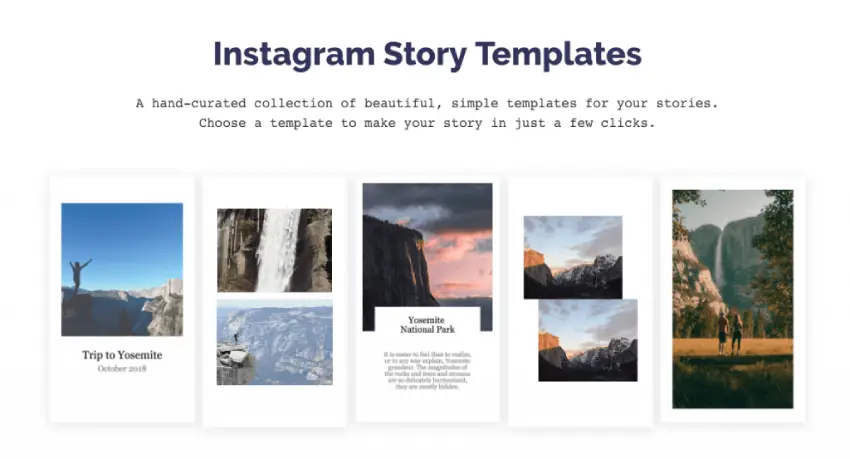
Kapwing is another great tool for finding social media templates. Liven up your images and content with stickers, text, gifs, and even videos. It’s totally free and you can use the website without downloading anything. But your images will appear with a small Kapwing watermark in one corner.
All that effort… for just 24 hours?
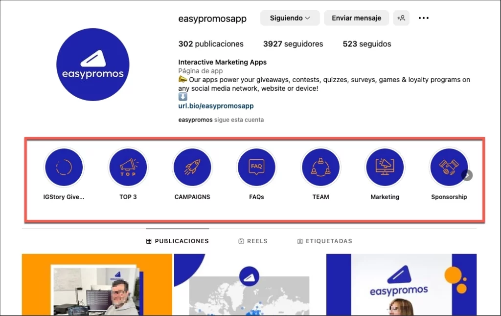
Well, no! You can highlight your best Stories so that they stay on your Instagram profile for ever, instead of disappearing after just one day. Highlights are shown at the top of your profile feed, above your regular feed of photo posts.
Your followers can view them whenever they want, as many times as they want. Don’t forget to customize the cover image of each highlight to keep up your brand aesthetic!
Stories are short and (relatively) ephemeral. But that doesn’t mean they go unnoticed. Your followers will spend more time on your profile if your Stories are worth watching – and that can only be good news for your brand. Try it and see for yourself!