Your website, an essential channel to draw traffic
In this day and age, not having an online presence is a synonym of failure. That is, brands without a website and social networks can lose up to 30% of their clients. Not having these channels can damage a brand’s reputation to the point of being considered old fashioned or even not be taken seriously.
We are fully immersed in the digital era and most people spend a great deal of time on their mobile devices, laptops, or tablets. Hence, the objective is to veer to your web in order to turn them into potential customers.
We all know we want to sell and be recognizable, but we don’t always know how to achieve that. What’s the use of having a website if users don’t visit? Or be present in social media if we can’t create an active community?
At this point, online promotions are an ideal tool to turn these visits into leads and, in so doing, boost brand awareness all the way to success. Include these actions in your website and you’ll see how your results improve while you simultaneously nurture your database with the participant’s data.
What is a banner and how to design one for your website
What is a banner
When we use the term banner, we simply refer to an online promotional creativity with some specific dimensions. It includes text, images, and even video or sound, and it’s embedded in a website. It’s objective is to generate brand awareness and give visibility to the website. As a general rule, the objective is that the user clicks on it and is redirected to a website. In this case, our contest or promotion.
Kinds of banners
Built-in banners
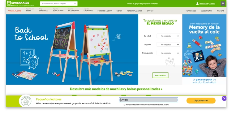
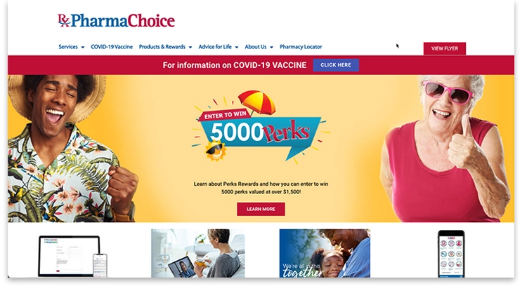
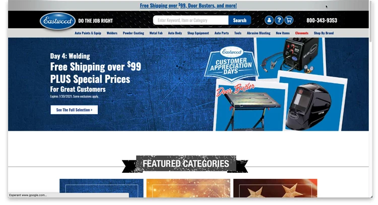
Built-in banners are fixed within the website. They are usually located on the laterals (vertical format) or at the top (rectangular format). This banner is well accepted by users as it doesn’t interfere.

Expandable banners
Expandable banners also have a fixed position, but they expand on the screen when the user performs a specific action, such as placing the cursor over the ad. These banners can be a little intrusive, so they usually have a visible “close” button.
Pop-up banners
Unlike the previous banners, pop-ups don’t have a fixed position on the screen. Rather, they accompany the users as they browse the site. They also pop up unexpectedly and therefore can be considered highly intrusive. Given this, you should be extremely careful when using them.
How to design a banner properly
Banners have been a long-standing resource in online advertising and, despite their age, still yield good results. Hence, you can expect them to be around for the foreseeable future. Precisely due to their widespread presence on the internet, it is very important to make sure that this imagery stands out from the rest to capture the users’ attention.
Almost everybody likes giveaways, so it shouldn’t be that difficult to draw attention to your banner if the message is clear. Thus, once the target is clear, the following steps are:
- Clear and direct language. Get to the point. If you’re giving away a trip for two, make it big. It should be the first thing the user sees. After that, in a slightly smaller font, you can give an overview of the participation requirements or dates. Depending on the image you are using, you can center the text or align it to the left or right.

- Mind the design. Choose an image that is related to the general imagery of your promotion, as well as the same fonts and colors. This will allow the users to make a direct connection to the advertising. In case you are running a Multi-stage promotion, the image can vary every time a new stage opens up.

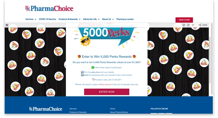
- Embed the promotion. Add a link if you want users to participate without leaving your site. With Easypromos you can embed it as a widget. This will make your campaign more visible.

- Include a CTA. It is important to us a Call to action so users click on the participation button. If you wish to do so, you can use the same color as in the buttons on the promotion.
- Optimize the size of the image. If you use images that weigh a lot, they might take too long to load, something to always avoid. Whenever possible, use web optimized images (72ppp resolution).
- Check the link. Before uploading the banner to the web, check that the promotion is working properly.
Online tools to design a banner
Lastly, if you don’t have access to a graphic designer, or don’t have the means for one, there are alternatives available that will get you out of a pickle.
These are three recommendable online design tools that you can use to design banners:
- Canva. Canva is a simplified online graphic design tool. It uses a drag & drop format and has over 60 million images and 5 million vectors, fonts and graphics available to use and export.
- Adobe Creative Cloud Express. A tool from the Adobe suite that will help you create wonderful imagery in minutes. Choose a photo, add text, apply a filter, and your image will be ready to upload. Adobe Spark is available in website and mobile app versions.
- Desygner. Same as Canva, Desygner is a collaborative design tool offering easy-to-edit pre-configured templates. There are thousands of free-to-use vectors, stickers, and backgrounds.
We hope you will find these examples and tips useful when it comes to designing banners and imagery for your promotions. So give it a shot and get started!
If you have any doubts or questions you can contact us via live chat. Our customer support team will be happy to help you.